Take a welding torch and melt down New York City into a puddle of gooey lights. Watch the elegant ambiance of the underworld crust around the edges. Scrape up the goo, pour it onto a wide-angle palette, and film it with an Alexa LF camera at night.
Good, you’ve just achieved an oversimplified but beautiful nightscape that mirrors the John Wick cinematography.
The fourth chapter has a two-hour and 49-minute runtime and Keanu Reeves speaks 380 words of dialogue. That’s not lines – words! But who needs words when the audience can melt into the starkly cool lighting of a world designed to wrap its viewers in a soft blanket of night and shower them with neon glow.
Nine years after the first chapter, the praise has almost reached hyperbole: IndieWire recently described the John Wick franchise as “…the most gorgeous series in the history of action cinema…”
Here, we enter the back alleys and hotel lobbies of New York City to explore why the cinematography of the John Wick franchise is so endearing, and the techniques that helped achieve an atmosphere that stacks color the same way John Wick stacks bodies.
John Wick
Directed by Chad Stahelski and David Leitch (uncredited), Cinematography by Jonathan Sela
Notable gear: ARRI ALEXA XT, ARRI ALEXA M, Hawk V-Lite Vintage ‘74 lenses

Photo credit: Lionsgate
One of the coolest color palette themes in any franchise is this one right here established in the original John Wick. I mean “‘coolest” both figuratively and literally. The idea was that John Wick begins the movie in a desolate world of loss, and as he wakes back up, so do the colors of his existence. This was articulated well in, of all places, the IMDB trivia section:
Initially, the movie is almost a cool blue monotone, reflecting John’s detachment and struggle to cope with his wife’s death. As he crosses back into the violence, colors leak back into his world and become more intense. And then at the very end of the movie when he at least attempts to cross back over into the ordinary world, the colors become more subdued again, but also warmer.
Director of Photography Jonathan Sela shot John Wick in 4K and largely utilized a couple of different cameras, notably the ALEXA XT and the ALEXA M for close-range work. In an interview with ARRI, Sela described the initial vision for the “John Wick look”:
Our main visual idea for the film was to achieve two different looks, one for John Wick’s normal life before the action begins and the other for the underground world he is drawn back into. We wanted the first look to be soft and clean, and the second to be grittier, darker and sharper.
The dichotomy between his retired life and assassin life is separated in one way by the camera movements: at the beginning, shots are static and immobile. When he re-enters the life, the camera is a kinetic moving force like John Wick. Sela spoke to this directly in the ARRI interview by saying that he largely utilized handheld work for the second portion of the film.
A great analysis piece by Bill Friedell for Cinemablography did a scene-by-scene analysis of when John Wick enters the Continental Hotel and how this return to his old life is indicated by color:
It’s the first instance where an entire location is given stark colors. The filmmakers even go to the lengths to spell out this contrast by showing John walking from his hotel room and going down an elevator straight into the hotel bar. The fact that it is a descent is also worth noting. This roots the drastic shift in lighting to the “underworld”. This is where the worldbuilding of John Wick comes into play. Not only do we learn of the rules of the Continental Hotel from the Hotel’s management (Ian McShane), but we also begin to fathom what this world looks like visually. This establishes the palette of the underworld. Stark greens, yellow, and hints of red (foreshadowing the role of a character later on in the narrative).
When you begin to match the use of color with Wick’s revenge romp, it’s not hard to start wondering, “Umm…is this an actual masterpiece?” Frequently in the first film, the cinematography matches John’s descent back into the underworld – Wick encounters undulating fluid reds (in the club) and cool liquid blues (fighting by the pool).
Jonathan Sela worked only on the first John Wick, but with Chad Stahelski and David Leitch, helped establish the importance of color for the rest of the franchise.
John Wick: Chapter 2
Directed by Chad Stahelski, cinematography by Dan Laustsen
Notable gear: ARRI ALEXA XT, ARRI Master Anamorphic lenses

Photo credit: Lionsgate
The cinematography of John Wick: Chapter 2 is tantamount to – I don’t know – graduating from spaghetti and meatballs to lobster thermidor at a fancy French restaurant. It’s all delicious, but now they’re doing it with a bit more ostentatious flair.
The second installment brought on cinematographer Dan Laustsen, and he’s been with the franchise since. A major notable change was the lens switch-up – while Jonathan Sela used spherical lenses for the night shoots to avoid flare issues, Laustsen wanted to purely use anamorphic lenses. In an interview with PIX, Laustsen spoke about their solution to achieve their need for sharp night images:
We tested a lot of lenses, he says. I’m a fan of Master Primes when I’m shooting spherical, but here we were thinking anamorphic. I’d never worked with Master Anamorphics, and testing led us to a precise and clean look with that glass. That look gives you nothing for free because the glass is so good. So working with Camera Service Center in New York, we added some nylon strings with an ND filter to give us a bit of flare whenever there’s a highlight. It’s like the old days when we would put a nylon stocking behind the lens. That was the basis of our approach.
He spoke about the color palette in the same interview:
We wanted a colorful movie, with rich colors, but not television colors. The reds are really red, and the steel blue is steel blue. There’s an overall desaturated feel, but with certain consistent and bold colors.
Starting to see a thematic contrast here, huh? The John Wick cinematography loves its reds and blues. You could make a wonderful montage of interpretative suggestions from this baseline of color choices: the cool blues represent Wick’s cold revenge against the red contrast of feeling alive again, the blues represent the Greek river Styx against the red backdrop of the Underworld – see, you can go on.
At this point in the franchise, Chad Stahelski, Dan Laustsen, and the rest of the team hold a firm authority on what they want in their world, and it’s time for them to expand on it. In Chapter 2, they playfully sit and splash in this universe and envelop the viewer in its rich colors. ScreenRant said it well in a March 2023 article ranking each film:
“John Wick exists so John Wick: Chapter 2 could thrive.”
John Wick: Chapter 3 – Parabellum
Directed by Chad Stahelski, cinematography by Dan Laustsen
Notable gear: ARRI ALEXA SXT Plus, Master Anamorphic lenses, ARRI ALEXA Mini
If John Wick 2 allowed the cinematography to breathe and come outside to wander around the playground, then John Wick 3 invites 40 kids to the sandbox and gives them all Skittles and methamphetamines.
This is the “John Wick unhinged” John Wick, or “The Rambo effect”, where each film strives to build on their previous body count. You can even see it in the promotional cover photo:

Photo credit: Lionsgate
The previous films that established distinct reds and blues – they’re congealed now. They have merged and the Underworld Assassin John Wick is no longer distinguishable from the Human-with-a-soul John Wick. Granted, you can find many gorgeous shots that carry over the red and blue theme from previous John Wick cinematography:

Photo credit: Lionsgate
But look at the backdrop of so many scenes, and John Wick’s world is a merged color wheel of chaos. Pure reds turn to heated oranges like the temperature’s been turned up. Distinct greens and blues are now teal or purple. John Wick lives to kill and there is no separation.

Photo credit: Lionsgate
Dan Laustsen interviewed with American Cinematographer upon the film’s release in 2019, and spoke to the idea that each film had to be more visually provocative than the last:
After we made Chapter 2, Laustsen notes, we discussed how we could make 3 even more visually powerful. The main setting was still New York, but we wanted to bring out the city even more forcefully. We decided to shoot all at night, with rain as much as possible. Rain is fantastic because it gives a third dimension to the picture, but it is a challenge to do it, especially in a city like New York.
Chapter 3 has a great argument for “most noir” of the John Wick films. Red street lights reverberate their glow off the gray asphalt under train tracks in a downpour. Wick staggers through the streets wounded and determined and always ice-cool. And you know that no matter where he stumbles, he will be bathed with just the right amount of cool LED light.
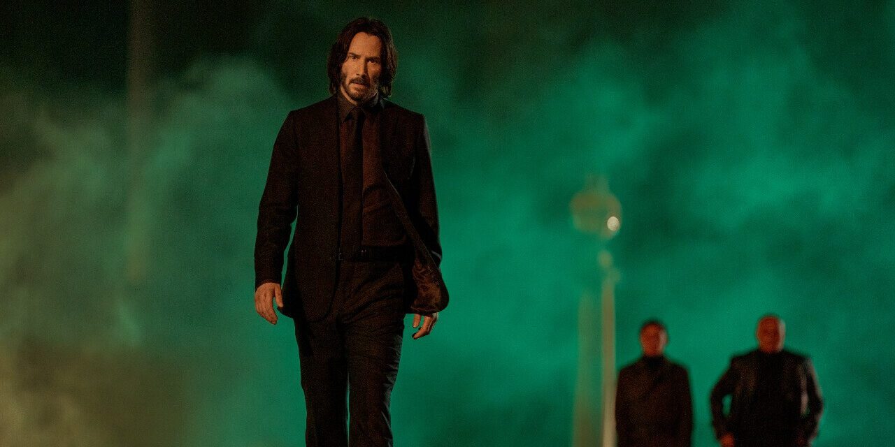
John Wick: Chapter 4
Directed by Chad Stahelski, Cinematography by Dan Laustsen
Notable gear: ARRI ALEXA LF (Large Format), ALFA large format X2 anamorphic lenses

Photo credit: Lionsgate
Each installment has gotten more outrageous with its stunts, more pronounced with its color palette, and it’s all been purposefully handpicked to continue escalating this liquid vat of stylistic cool. So, it’s a natural progression of visual wonderment that Chapter 4 graduates from 4K to IMAX.
At the foundation of Chapter 4, the wide-angle large format approach gave the film a sophisticated sense that you could be lost in a spectacular vast world and experience a greater emotional connection at the same time. To achieve this, their goal was to capture even better close-ups of their star and give Keanu more room to express himself within his stunts. Frame Voyager did a wonderful seven-minute video breaking down the wide-angle approach, and they quoted Laustsen telling the Motion Pictures Association of America:
“We wanted to make more powerful images of the characters, especially Keanu.”
The ALEXA LF camera Laustsen used has the second-largest sensor in Large Format filmmaking (36.7 mm x 25.54 mm). The theory (one that appears to have been super-effective in Chapter 4), is that a wider field of view allows for greater audience immersion.
Now, watching Keanu Reeves sit down with Bill Skarsgaard for a meet between criminals – even the fleeing flock of pigeons has this gravity of, “Oh, look at how poetic the pigeons are – I can totally see their fear”.
“Luscious melty noir” might be “polar arctic black-and-white” in the next installment
That’s the appeal of a franchise backed by artists who have worked tremendously to make each film more of a visual technical challenge than the last – you don’t know where it’s going to evolve. The creators are playfully challenging themselves in a vast playground of visual gymnastics, and the result is a series of films that seem to feel bigger and bigger in scope.
In 2023 interviews with Stahelski and Laustsen, they dropped quotes about how they were influenced by directors like Bernardo Bertolucci, or influenced by their drive to simply take the color palette where it hasn’t been before.
In fifteen years, a young action-arthouse director might sit down in front of an interviewer, and without a hint of sarcasm:
“Who is the biggest influence on my style, you ask? Tarantino? No, no. Michael Mann? No, no. Let me tell you about the first time I saw John Wick: Chapter 4.”

